Brat Generator – Create Custom Designs In The Iconic Brat Style
Some designs become popular because they are detailed, polished, and visually complex. The Brat aesthetic went in the opposite direction. A bright green background, simple lowercase lettering, and a slightly rough appearance were enough to create one of the most recognizable visual styles of recent years.
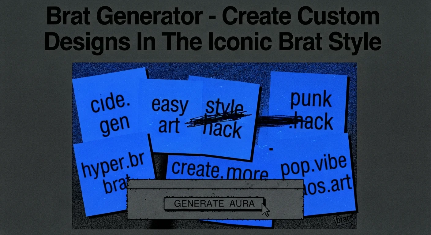
A brat generator makes this style easy to recreate without requiring graphic design software. Instead of manually choosing fonts, adjusting text, changing colors, and applying effects, users can enter their own words and generate an image based on the familiar Brat-inspired look.
This guide explains where the style came from, what makes it recognizable, how these generators work, what features to look for, and how to create better-looking designs.
What Is a Brat Generator?
A brat generator is an online design tool that creates images inspired by the visual identity associated with Charli XCX’s Brat era. The original album artwork became widely recognizable because of its deliberately simple design: a vivid lime-green background combined with lowercase typography.
The album Brat was released in 2024, and its artwork quickly became much more than ordinary album packaging. The visual style spread across social media, memes, fan creations, profile pictures, posters, and other digital content.
Most generators take that basic formula and turn it into an editable template. Instead of displaying only the original album title, they allow users to enter their own text.
Depending on the tool, users may be able to control:
- The words displayed on the image
- Background and text colors
- Font size
- Text position
- Blur or softness
- Alignment
- Additional visual effects
- Image size and download format
The main attraction is simplicity. You do not need advanced knowledge of Photoshop or another design program to produce something that resembles the familiar aesthetic.
Where the Brat Style Came From?
The style is connected to Charli XCX’s sixth studio album, Brat. Its visual identity deliberately moved away from the highly polished photography and elaborate artwork commonly associated with major pop releases.
The cover uses a strong green color with minimal typography. The typography itself is based on an ordinary sans-serif style rather than a highly decorative custom typeface. Sources describing the design commonly identify it as Arial or an Arial-based treatment, with stretching and low-resolution effects contributing to its unusual appearance.
That simplicity was an important part of the visual impact. Nothing on the design tries to compete with the main word. There is no complicated illustration, detailed background, or collection of decorative elements.
The result was easy for people to recognize and, just as importantly, easy for other people to recreate.
That helped the style move beyond music and become a wider internet design trend.
What Makes the Brat Aesthetic Different?
At first glance, the design can look almost too simple. However, several small choices work together to create the recognizable appearance.
The Bright Green Background
The green background is probably the first thing people notice. It is a highly saturated yellow-green shade that gives the design an immediate visual identity.
Different recreations may use slightly different green values, so not every generator will produce exactly the same shade. A commonly referenced approximation is around #8ACE00, although variations appear across online tools and recreations.
The important point is that the background is not an ordinary soft or pastel green. It is intentionally loud and difficult to ignore.
Simple Lowercase Typography
The lettering is another major part of the design. Instead of an elegant script or futuristic display font, the Brat look relies on a basic sans-serif appearance.
The text is generally shown in lowercase and may be stretched or adjusted to create the slightly awkward proportions associated with the original artwork. Some generators also apply a subtle blur or low-resolution treatment.
This creates an interesting contrast: the font itself is ordinary, but the way it is manipulated makes it recognizable.
Minimal Layout
There is usually very little happening around the text.
A typical design contains:
- One short word or phrase
- A flat background
- Large empty areas
- Minimal decoration
- A simple square composition
That lack of extra information is actually one of the style’s biggest strengths. The viewer understands the message almost immediately.
How Does a Brat Generator Work?
Although the finished image may look basic, the generator usually combines several design settings behind the scenes.
First, the user enters a word or phrase. The tool places that text onto a digital canvas. It may automatically convert letters to lowercase or resize the text to fit the available space.
Next, the generator applies the selected typography and visual treatment. Depending on the tool, this can include stretching, spacing adjustments, blur, or other effects designed to imitate the original appearance.
Finally, the design is rendered as an image that can be saved or shared.
The basic process usually looks like this:
- Open the generator.
- Enter your word or phrase.
- Select the preferred background color.
- Adjust the text size or position if available.
- Add a subtle effect such as blur when appropriate.
- Preview the result.
- Export the finished image.
Some tools also provide preset styles, alternative colors, or additional effects for users who want something beyond the classic look.
What Can You Create With One?
The original concept is associated with album artwork, but the format works for many different types of personal graphics.
Social Media Posts
Short phrases work especially well on social platforms because the design is easy to understand while scrolling.
You could create a graphic featuring:
- A nickname
- A short reaction
- A funny phrase
- A personal slogan
- A current mood
- A simple announcement
The strong background also makes the finished image easy to recognize in a busy feed.
Profile Pictures and Avatars
A square image is suitable for many profile-picture formats. A person’s name, username, or short phrase can be placed in the center while keeping the overall design minimal.
Because there is little visual clutter, short text remains the main focus.
Memes and Jokes
The style also works naturally for memes. A familiar phrase can be placed against the recognizable green background to create a deliberately simple joke.
The less complicated the message, the better the design usually works.
Playlist and Personal Cover Art
Users can also adapt the format for playlists, personal projects, podcasts, mood boards, or fictional albums.
However, when creating something for public or commercial use, it is worth remembering that an inspired design is not automatically free from trademark, copyright, or other rights considerations. A fan-made graphic for personal sharing is different from selling products that deliberately imitate another artist’s branding.
How To Get A Better Result?
Creating the image takes very little time, but the wording and layout still make a difference.
Start with a short phrase. The visual style is strongest when the text remains easy to read and does not overcrowd the canvas.
Keep these tips in mind:
- Use short, memorable wording.
- Avoid filling the entire image with text.
- Keep the background simple.
- Use lowercase when you want a closer visual match.
- Do not overuse blur.
- Check the image at its final size before downloading.
- Try different text sizes until the composition feels balanced.
The goal is not to add as many effects as possible. The original appeal comes from doing very little and allowing the typography and color to carry the design.
Why Did This Simple Style Become So Popular?
The popularity of the Brat aesthetic shows how recognizable a visual identity can become without complicated design.
The combination of an unusual green shade, plain lettering, and intentionally imperfect presentation was easy to identify. More importantly, it was easy for ordinary internet users to reinterpret.
That made the design particularly suitable for memes and social media. Someone did not need professional software or graphic design experience to create their own version.
The aesthetic also matched the personality associated with the album’s cultural moment. It felt casual, bold, messy, and intentionally unconcerned with traditional ideas of polished pop branding.
As a result, the design became useful as a visual language rather than simply an album cover.
Brat Generator vs. Traditional Design Software
Traditional tools such as Photoshop, Illustrator, and other graphic editors provide far more control, but they also require more time.
A brat generator is designed around one specific visual concept, so the process is much faster.
| Brat Generator | Traditional Design Software |
| Quick to use | More time required |
| Usually beginner-friendly | Requires more experience |
| Built around a specific style | Almost unlimited creative control |
| Simple text customization | Advanced typography and image editing |
| Fast export | More manual preparation |
For a quick social graphic, a generator can be the more convenient choice. For a professional design project that requires detailed editing, traditional software offers much greater flexibility.
Is It Difficult to Use?
For most users, no. These tools are generally designed around a straightforward text-to-image process.
You normally do not need:
- Graphic design experience
- Font installation
- Complex editing software
- Advanced image-processing skills
The biggest creative decision is usually what you want the image to say. Once the wording is ready, the remaining steps are mostly about choosing the visual settings and checking the final composition.
Final Thoughts
The appeal of the Brat aesthetic comes from its unusual ability to make a very simple design feel instantly recognizable. The bright green background, basic lowercase typography, stretched appearance, and intentionally rough finish created a visual identity that could be copied and adapted almost immediately.
A brat generator turns that idea into a simple creative process. Instead of building the design from scratch, users can enter their own words, adjust a few settings, and produce a ready-to-share graphic.
Whether the goal is a meme, profile image, social post, playlist artwork, or just a fun experiment, the format works best when it stays true to the basic principle behind the style: keep it simple, make it noticeable, and let the text do most of the work.